Exercise 7.3. Here is a conversation between two students about how to make a scientific poster. Complete the question part.
A Should I _____________________________________in the title?
B Do not capitalize the first letter of each word. Write the title as a sentence. Remember, you should create a title that can be easily read from a few feet away.
A What should I _____ in the Introduction ?
B Be brief and only include essential information.
A How to organize _____________________________ ?
B Break the Materials and Methods section into subsections with images or diagrams. Or use a flow-chart.
A Should I ____________________________________?
B Break the Results section into subsections with headers summarizing the key findings for each set of graphs.
A What is the best way of organizing Discussion/Summary?
B Make a diagram outlining the major differences you found.
A Then, Conclusions/Future Directions. There should be a statement of the main research outcome(s).
B Right you are.
A Is it necessary ______________ in the poster?
B Acknowledgements section is desirable. You may thank the people that deserve thanking such as your advisor, collaborators and grant support.
A Is it better to ______________________________________________?
B Use columns to organize your information, not rows. Depending on the size of your final poster, you may want 3-4 columns.
A Should I use large headers to outline sections and break-up text? I’m fond of coloured blocks with white writing.
B Sure. These also help delineate the columns without using a border for each column (which is a bit dated).
A What are the requirements for a _____?
B Do not use a busy background. Stick with a simple white or solid colour background. You do not want to distract from your data.
A What color _____ the text be?
B You should use black or dark font. Stay away from coloured text as it is difficult to read.
A What should I do, if I am ______________________________________?
B If you are getting into more than 4-5 lines of solid text, stop and think about how you could summarize this better with a diagram or image.
A ____________________________or complex?
B Your graphs should be simple, with axis titles that are legible from a reasonable distance (i.e. 2-3 feet). Remove any background or gridlines as they obscure the data.
In pairs, practice the dialogue.
Exercise 7.4. Read the text about the use of color in a scientific poster.
Carefully consider your color choices. Aim for two or three colors at the most; you can also use lighter and darker shades of your colors.
|
|
|
Avoid white or light colored text and dark backgrounds because light text is hard to read. Instead, opt for dark text on a light background.
Avoid busy backgrounds. If you use a pattern or a photograph as your background image, make sure that your readers can still read your text. Fill your text boxes with a color that complements your color scheme so that your text is still readable against the pattern. Ensure that your background does not visually compete for the reader’s attention with the other design elements (text and visuals) on your poster. Your readers should not really notice the background. If they do, they’re probably not looking at the other information on your poster.
Use ‘warm’ colors such as red, orange, and yellow sparingly and only to accent the other features of your design. Use ‘cool’ colors such as blue, green, and purple as your dominant or main color. Warm colors can quickly visually overwhelm your readers and create too much contrast.
Say if the following sentences are true or false.
1 Aim for two or three colors at the most.
Avoid white or light colored text and dark backgrounds.
3 Choose light text on a dark background.
4 If you use a pattern or a photograph as your background image, make sure that your readers can still read your text.
5 Ensure that your background does visually compete for the reader’s attention with the other design elements (text and visuals) on your poster.
6Your readers should really notice the background.
7 Use ‘warm’ colors to accent the other features of your design.
8 Use ‘cool’ colors as your dominant or main color.
Exercise 7.5. Look at the examples of conference posters A and B, and decide how well they have been organized. Then, in pairs, discuss positive and negative points of these two posters.
Which poster do you think is more successful? Why?
Example of a conference poster A
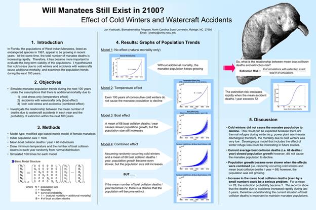
This poster was created and first presented during a graduate biomathematics course at North Carolina State University. It was thereafter presented at several other venues focused on biological conservation.
|
|
|
https://projects.ncsu.edu/project/posters/examples/GeneFlowInLions/
Example of a conference poster B
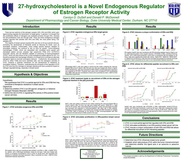
http://phdposters.com/gallery.php
Дата добавления: 2019-09-08; просмотров: 507; Мы поможем в написании вашей работы! |

Мы поможем в написании ваших работ!